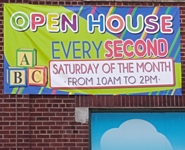
If you stop to read, you realize that open houses are held every second Saturday, not every second. I imagine that’s what the poster’s creator (I use the term loosely) said when someone pointed out the difficulty with the way this sign is laid out.
How many people stop to read? Not many, for sure. Probably only wordy-nerdy folks like me and a few people who are in the market for day care.
Will anyone be misled by the sign? Maybe not. The idea of an open house every second is just too improbable.
Will anyone laugh? I can answer this one definitively: Yes, someone will laugh. Someone did.
Copies of this sign appear on three sides of the building. It’s also posted at a companion facility a mile or so away. The people in charge of signage at this day care spent actual money on printing.
If only they’d also spent actual money on a professional designer, or even just a proofreader.
Instead, they took the text the director had approved and pasted it into a free template. They saw, correctly, that this template screams both “open house” and “children.” They did not see that their text didn’t fit the spaces allowed in the template without doing violence to the meaning.
Or maybe they did see but decided it didn’t matter.
The best choice is always to design around content. If you can’t afford to pay a designer, then choose a template that fits your text, even if you have to pay for it.
If you can’t afford to pay even for a template that fits your text, then revise your text to fit the template.
Don’t count on people reading carefully. Don’t assume that being colorful makes up for being easy to understand.
And when someone points out that it’s easy to misread your sign (email, report, PowerPoint, whatever) never, ever say, “It doesn’t matter. People will figure it out.”


