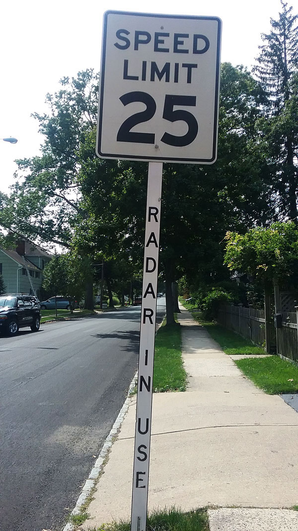
 What could possibly go wrong with a speed limit sign?
Nothing, until someone decides to add information.
Perhaps you’ve noted the added information on this sign because of the way I photographed it.
I’m pretty sure people will not note the added information when driving a car, even if they’re creeping by at 24 miles per hour.
I usually try to figure out what was going through people’s minds when they make communications mistakes, but this time I’m stymied.
- Why did they feel the need to write “radar in use” at all?
- Assuming there was a need, why would they write the message where it’s almost certain not to be seen?
I can’t even.
Any guesses? Maybe they don’t want people to read the message so they are more likely to catch them speeding?
The point is clear: If you have something you want to communicate, you have to put it where people can see it.
Can you always tell whether people can see it when you’ve been working on that website for six months or putting in late hours on the annual report for three weeks?
No. That’s why it’s wise to get a second opinion. If you’ve got a clear thinker with good eyes and a heart for your audiences’ needs and desires roaming around the office, use that person. If not, contact me.

