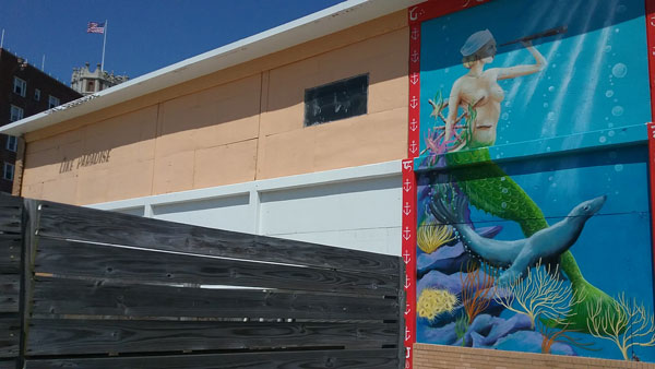
The sign I want to show you today is on a wall by the boardwalk in Asbury Park, New Jersey. Here’s the context:

The mermaid mural is lovely, but I want you to see the much smaller sign to the left.

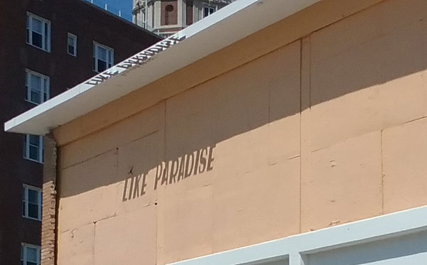
“Like paradise.” Isn’t that a worthy message? The sign doesn’t advertise anything, as far as I can tell. I presume it is, like the mural, public art.
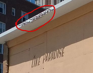
Can you see how the sign works? I should have taken one more photo, standing directly under it and looking up. The sign on the wall is the shadow of letters that are sticking out from the edge of the roof, parallel to the ground.

I was knocked over by how great this sign is.
- It offers a positive message.
- It does something different.
- It makes creative use of what’s there, in this case a southward-facing wall and the sun,
As you launch into the program year, how can you do likewise? Can you, for example:
- Tell a feel-good story? Say “thank you” before you receive a gift? Offer a benefit and not expect a return?
- Try a new medium? Reach out to a new audience? Take a chance on a strategy you’ve been advised to try but resisted?
- Tap a resource you’re not using fully? Repurpose an old publication, a neglected webpage, or a story you wrote up but never used? Discover a hidden talent? (Maybe a colleague’s? Maybe yours?)
How can we make your communications positive, different, and creative? What are your ideas? Post below!
If you can’t think of any way to make your communications a little more “like paradise,” be in touch. We can think together.


Bravo
Thanks, Maggie!