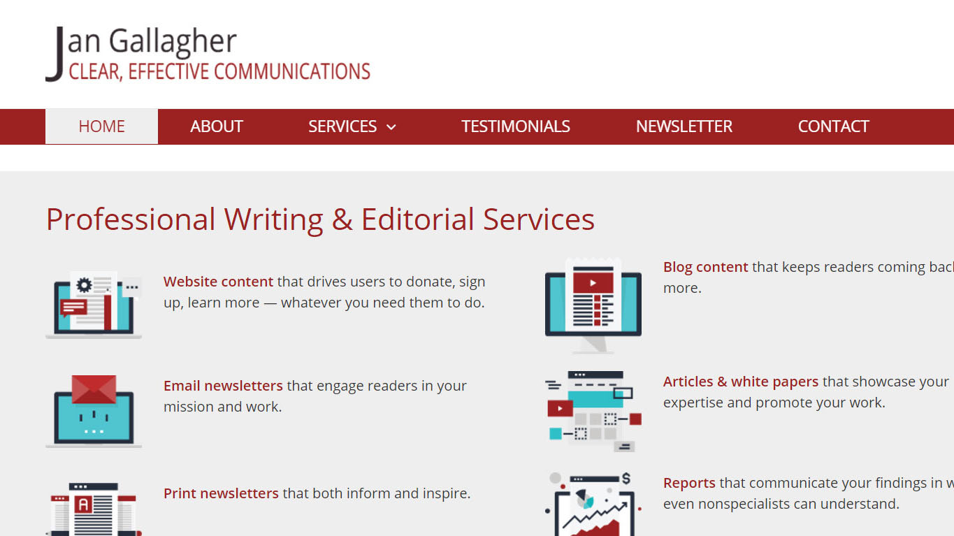
Is it time to revamp your website? If so, I’ve got some tips for you from my own recent redesign. (Check out the home page at www.jangallagher.net.)
1. Don’t put it off.
My old website launched in 2007. Though I had regularly added and updated content, the site itself was a dinosaur.
2. Stockpile assets.
My website has exactly one photo: a 10-year-old headshot. I didn’t have time or money to get good photos of myself, of the clients who gave testimonials, or even, as a test user suggested, of one of the great Jersey City coffee shops where I sometimes work.
3. View your website as an investment in your business.
I could have used a “for dummies” tool like Wix to put together my own website.
I didn’t because I’m not a dummy.
Building a website takes three skill sets: design, programming, and writing. I paid for the two skill sets I don’t have. If you’re not a professional in one or more of these areas, you should expect to pay for all three.
If you don’t know how to get started, contact me for a free consultation.
4. Develop a design brief.
A design brief tells your web team about your business, your competition, the image you want to project, and what you need your site to do.
Having a design brief saves the time and money you’d waste on miscommunication. If you’re interested, I can share how-to’s.
5. Choose professionals who will be full partners.
You don’t have to work with your nephew because he needs the money. Choose carefully!
- Look at websites for businesses similar to yours.
- Ask for recommendations.
- Look at web firms’ portfolios.
- Get bids – but don’t decide on price alone. Quality counts!
6. Collaborate with your partner(s).
I didn’t just tell my web designer what to do. Sometimes she told me.
7. Conduct user testing.
I tested at several points:
- When the site was just a static picture
- When it was first coded as a usable site
- Just before launch, when I thought it was finished
My goal was to find out if users could find what they wanted. During in-person or phone meetings, I asked my testers to talk me through what they were seeing and doing as they explored the site.
I couldn’t change everything people saw as flaws. But I did make some significant additions and design tweaks in response to testers’ feedback.
You’re too close to your own site to see whether it’s working as intended. You need feedback from potential users.
I could go on and on. Let me know if you want to chat about any of these ideas.
What’s your experience with keeping up and occasionally revamping your website? Can you share any lessons learned? Post your thoughts below. Maybe you can save others the hassle or heartache you went through.


